“I have too many points on my map. It’s making things so slow.”
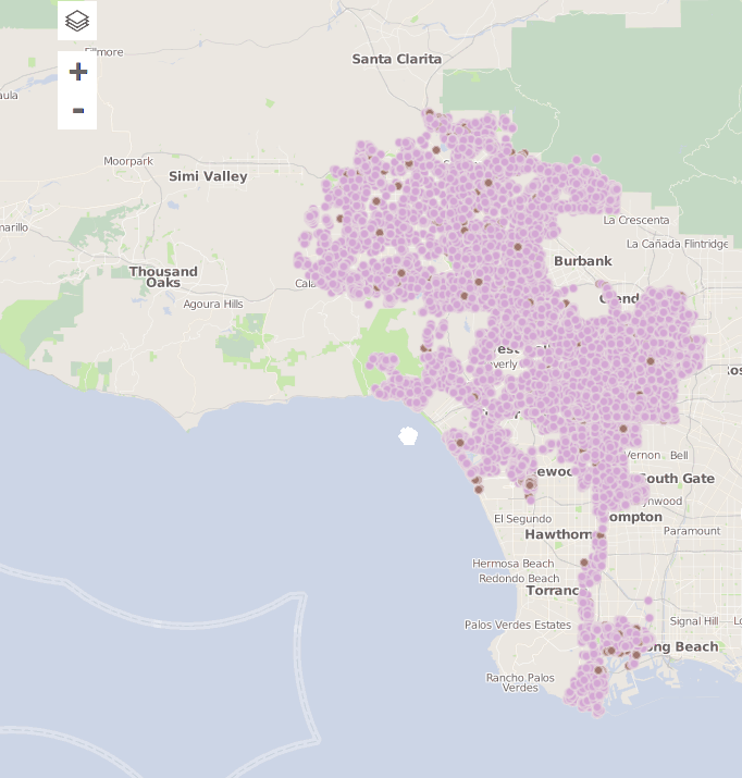
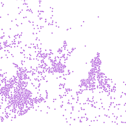
This comes up pretty often when you try to map many points on a webmap. Once you get over a few thousand points, your browser really starts to chug! For example, the map above is running with the mapping library Leaflet and has around 30,000 points on it. Zooming (making the map more or less detailed) and panning (those attempts you see above to pull the map to the left, then the right) at the very least test your patience.
What is to be done?
First it’s worth considering whether you actually need all those points to be present on the map at all times. If not, you have a few options.
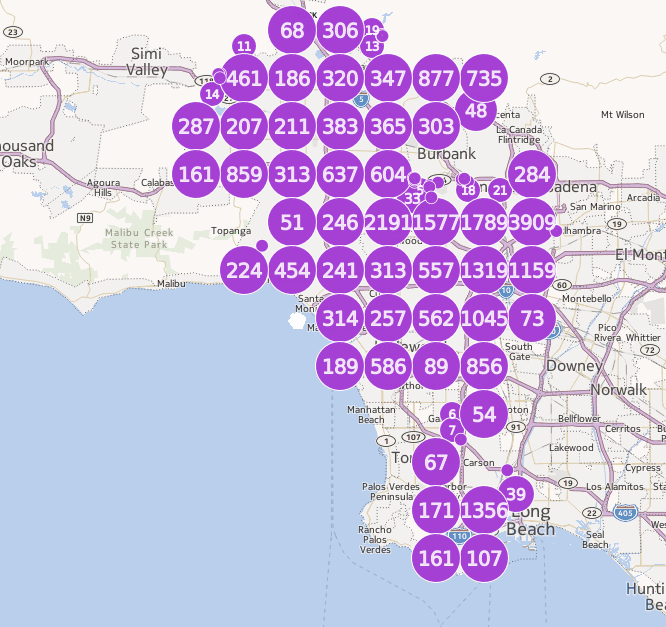
You could cluster your points. At higher zoom levels, the points are clustered geographically and form a single point per cluster. As you zoom in, you can see more details. The above is a clustered version of the map using the same exact data in CartoDB. You could do a very similar (and in my opinion better-looking) thing with Leaflet and the markercluster plugin.
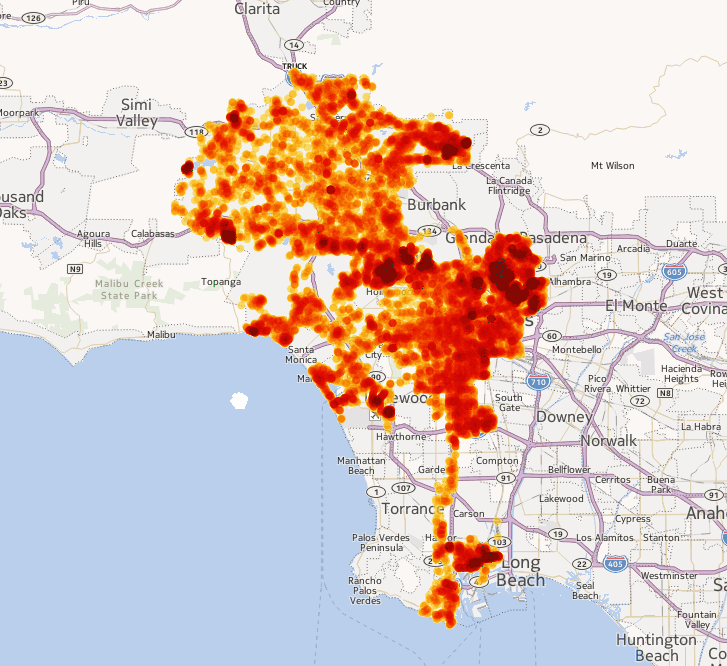
Not a fan of clusters? A heatmap might work for you, then. With heatmaps, the color becomes more intense where there is a higher density of points. The above example is the same data we’ve been looking at, using the “intensity” visualization wizard in CartoDB.
If you’re using Leaflet, you could easily make a similar heatmap using a plugin called Leaflet.heat, and it works fine with 10,000 points and likely more.
Finally, if clustering and heatmaps aren’t going to work for you, there are ways to display this many points on a webmap without making everyone who uses your map angry.
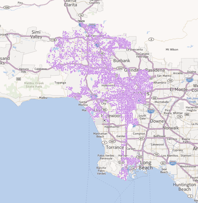
You can use CartoDB, as I am above with the same data as in the rest of the screenshots. Notice that every point is represented individually, but the map is still fast and responds well to interaction. I don’t show it here, but you could also click on each individual point.
The reason CartoDB can do this is technical but important to grasp–they draw your points as images much like the tiles that make up the base layer of a webmap. Depending on the density of your data, thousands of points might end up in one of these images. And if you want to click on the points in those images, you use a technology called UTFGrid which was created by Mapbox. This saves your browser a lot of effort since it doesn’t have to know much about each individual point and doesn’t have to worry about drawing and moving each point around.
These images look like this:
and are overlaid on top of the map.
You can do very similar things with Mapbox, but there are two features of CartoDB that make it particularly well suited to applications you would usually write in Leaflet:
- You can modify your data using their SQL API.
- You can dynamically filter the data to be displayed on your maps using their CartoDB.js API.
The latter is important because it is hard to do efficiently. It’s possible to set up a similar tile layer using TileStache and its Mapnik Grid provider, but you cannot dynamically filter the data that those layers show. You have to create layers for each permutation of your filters that you want to your users to be able to make.
This isn’t too bad if you are filtering land features that have broad categories of ownership such as private and public. You would have a layer for each type of ownership, and your map could turn those layers on and off as necessary. It gets complicated, though, if you need to filter by the acreage of that land in a granular way–how many acreage layers would you have? and would you have acreage layers for each type of ownership?
At which point it’s worth asking yourself whether all your filters are really necessary. Maybe they’re not and you can go the TileStache route. Maybe they are, in which case you should probably check out CartoDB.