The demographics of Google Maps' interesting areas
Here’s what happens to New York if you remove the areas that Google Maps says are “uninteresting”:
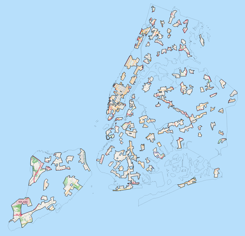
(Map tiles via OpenStreetMap © OpenStreetMap contributors)
In the summer of 2016 Google started displaying what it calls “areas of interest” on its maps, making portions of the map a slightly-emphasized beige-orange as opposed to the standard gray. In the company’s press release, Google says it is using an “algorithmic process” augmented with a “human touch” in more dense areas, but it doesn’t go into detail about what data is being used by these algorithms. As suggested by this CityLab article by Laura Bliss, there is indeed a likelihood of bias in how Google determines which areas are “of interest” and which are not. One clue toward what kinds of places Google Maps finds interesting comes from CityObservatory, which overlaid storefronts on the map and anecdotally showed that areas of interest are often in places with an abundance of storefronts.
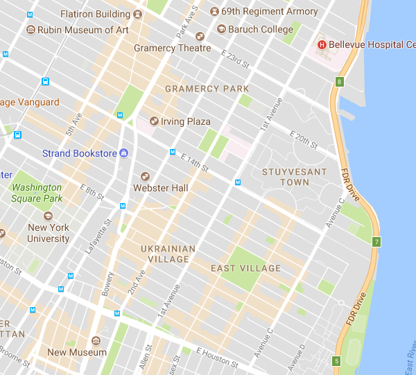
If you haven’t noticed them, here are the areas of interest around the East Village:
Since Google doesn’t describe its process for creating these areas any more than, essentially, “algorithms happened and then humans changed things in an unspecified way,” we have to assume that it uses the digital representations of the areas that it has available to it, including web pages it has indexed, map data it has collected and created, and other data such as mobile data on the usage of such places. For example, soon after releasing the areas of interest change on Maps, Google showed just how much information they have about businesses and other venues when it added a feature that shows how busy a place is in real time.
What does it mean when a corporation starts defining especially subjective phenomena such as the interestingness of our cities? Then presents its findings as objective facts – areas with firm boundaries? When a map contains ads, doesn’t it have a duty to its ad customers to draw eyes toward those ads?
It certainly does seem that based on Google’s data and financial interests, the areas it chooses to highlight will be skewed toward commercial areas and areas where people have money to spend.
In the spirit of the aforementioned articles, I decided to use census data to get a better idea of whether there is a noticeable degree of bias in the way areas of interest are drawn.
Two cities: interesting and uninteresting
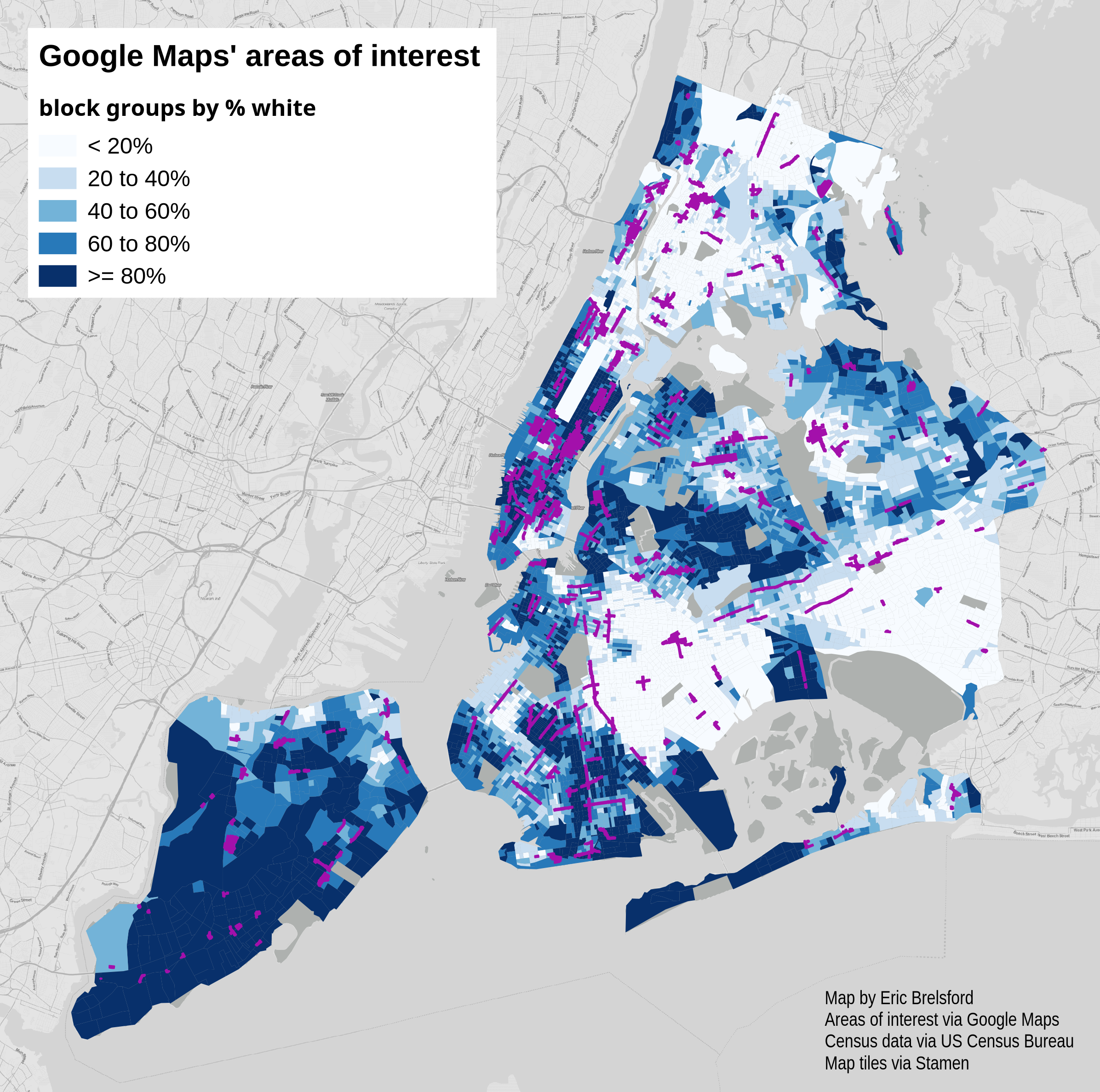
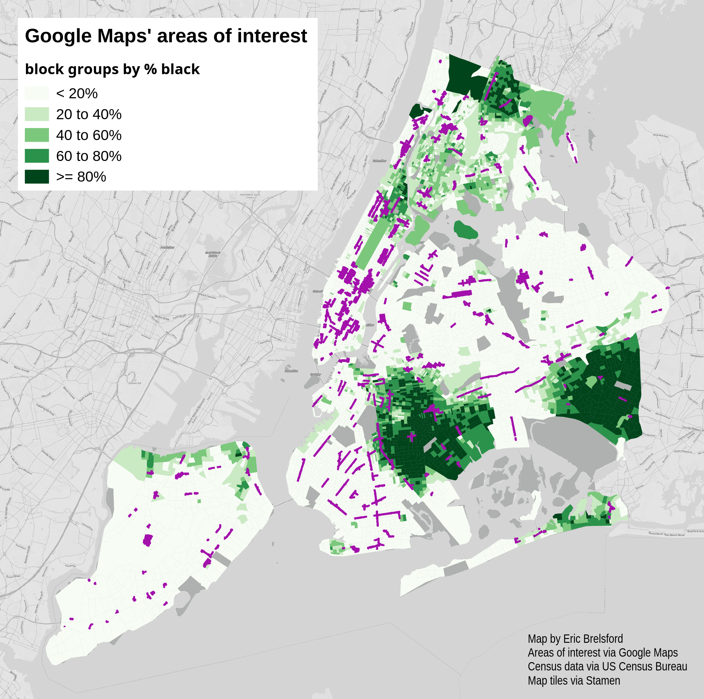
Let’s think of New York as two separate cities, the interesting and uninteresting cities as determined by Google Maps. When we compare these two cities the demographics are significantly different. The census block groups in the areas highlighted by Google Maps are 48.5% white while the block groups outside of these areas are only 40.7% white. Similarly, the highlighted areas are 17.5% black compared to 27.8% black outside those areas.
The big differences are in the black and white populations, but for completeness’ sake here is the full breakdown. (These labels courtesy the Census Bureau.)
- white: 48.5% inside interesting areas, 40.7% outside interesting areas
- black: 17.5% inside, 27.8% outside
- asian: 13.9% inside, 13.3% outside
- american indian: 0.4% inside, 0.4% outside
- native hawaiian: 0.05% inside, 0.03% outside
- other: 16.1% inside, 14.5% outside
- two or more: 3.4% inside, 3.1% outside
Here are a few maps of the census blocks with the traced areas of interest overlaid. By percent of population identifying as white:
By percent of population identifying as black:
Similarly, if we look at household income we see a bit of a skew, though less pronounced than the racial differences: in the interesting city 29% of the households have an income of over $100k versus 25% in the uninteresting city.
Percent of households with an income of $100k or more (green), areas of interest (purple):
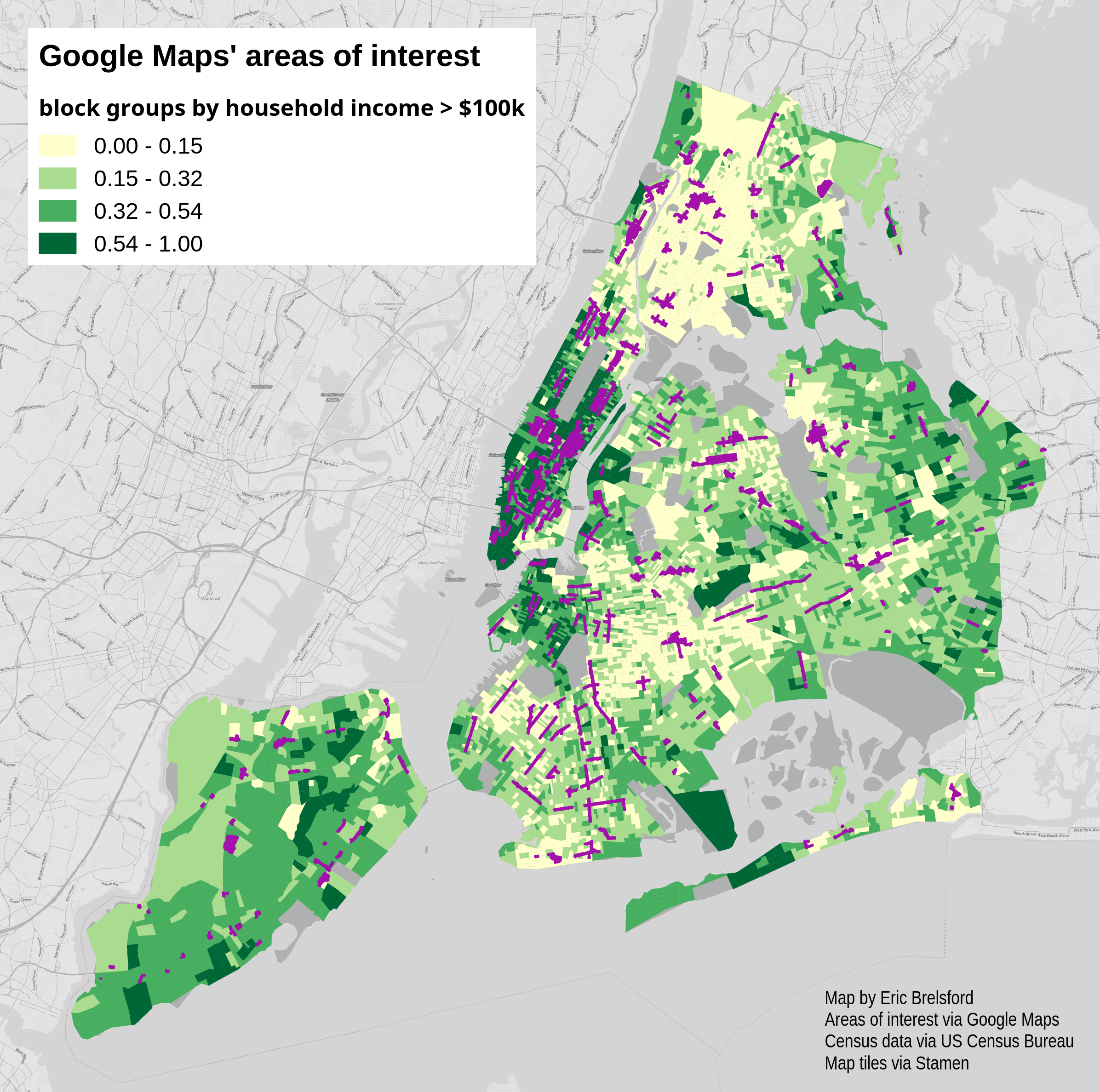
It does very much seem that the areas of interest in New York are skewed toward more white and affluent parts of the city. I have a feeling that these discrepancies align with other spatial inequities in the city – the areas seem to fall into the more transit-rich parts of the city; which are places that are more likely to be threatened by gentrification; which brings along people who are whiter, more affluent, and likely using the internet and smartphones more. I don’t blame Google for much of this (in New York at least) but it is disturbing seeing these areas enshrined as the “interesting” places.
Methods
First I traced the areas of interest. I did so in QGIS using QuickMapServices to pull in a Google Maps layer. I traced the layer at a scale of 1:7500, looking for areas of interest in the five boroughs of New York. The scale is important because as you zoom in to a smaller scale the map shows individual buildings as areas of interest. As you zoom out, the areas become more generalized. The scale I chose feels like an appropriate middle ground between very generalized and not generalzed at all. This scale also feels like the scale at which someone might realistically pan around the map – I want to see what the demographics are in the areas that someone will see in these zones while browsing the map in the area around them.
The traced areas certainly were not perfectly traced, but even when they were sometimes they cut through parcels. I decided to find the parcels according to city data that were at least 30 percent within an area of interest. To combine nearby parcels and make the areas fuzzy again, I decided to buffer these parcels by 15 meters. The result, as you will see, is not a perfect copy of the areas of interest, but it is close enough at the scale I am interested in. In order to do demographic analysis with the areas I selected the census block groups that are overlapped by the areas of interest.