Google Maps' areas of interest: update
A while back I looked into the “areas of interest” Google started putting on their maps. As a refresher, these are the yellowish areas along some streets such as here:

Via Google Maps
I’m curious about these areas in part because I sometimes find them useful when traveling in new cities. If I am wandering around a new place I occasionally look for them on Google Maps as a potential region to explore. Sometimes these areas are very much worth visiting. Usually I am walking a bit aimlessly, stakes are low, and it might not matter much if the areas aren’t specifically what I find interesting.
But the real reason I find myself returning to these areas of interest is that people use them and we don’t fully understand them. When I show Google Maps to students, most do not know what those areas are though they have theories. For example, one recently said they thought the areas were commercial areas. Even relatively tech-adept people seem to assume that these yellowish blobs represent something that objectively exists in the world, the way many of the other markings on Google Maps represent things that exist, such as the vegetated areas that were recently updated. Areas of interest do not exist. They are not business improvement districts or commercial zones or some other kind of designated area. They have been created algorithmically, and Google has not been clear about the full extent of the data and processes that have been used to generate them.
All maps are loaded with the perspectives of mapmakers, and a complex map like Google’s is the product of thousands and thousands of decisions and judgements, some more clearly subjective than others. Why not have a legend that describes how areas of interest were generated, or at the very least some indication that they were generated? Why not give us a little more agency when choosing whether or not to be influenced by areas of interest?
I don’t necessarily dislike them. As I said, I have found them useful at times. But they have been created through an opaque process, and I have a feeling that people use them. Sometimes they are likely used unconsciously, seeing as how the yellow is essentially the mark of a highlighter on the map and will draw people’s eyes. Other times they are used intentionally, but perhaps the person using them does not always know what they are using: arbitrarily drawn map-blobs.
And they’ve changed–a lot.
Changes between 2017 and 2019
I traced every area of interest within NYC back in 2017. Out of curiosity I recently overlaid the shapes I created in 2017 on top of Google Maps and saw that seemingly every area has changed in some capacity–some are gone, some are new, most have grown or shrunk in some way. I decided to trace every area of interest in NYC again in order to have a (December) 2019 dataset to compare with.
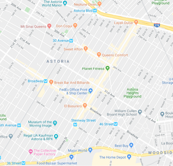
Via Google Maps
Above you can see Google Maps in part of Astoria, Queens (accessed December 2019) with the old areas of interest from 2017 overlaid in brown. This is how many neighborhoods’ areas of interest have changed since 2017–some areas have apparently become less interesting and are no longer highlighted (see, for example, the area around the Museum of the Moving Image in the bottom left) and others have grown or adjusted.
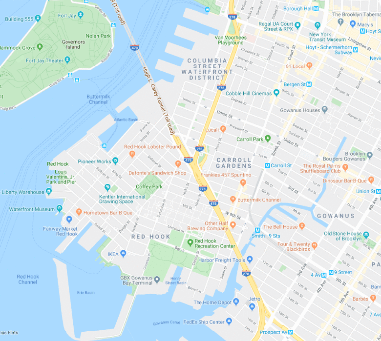
Similarly here in Brooklyn from Red Hook (now, a bit surprisingly, uninteresting) to Carroll Gardens and Gowanus (both more interesting):
These tweaks are worth examining, but I also want to get an idea of the overall change citywide. Looking at NYC’s NTAs (Neighborhood Tabulation Areas, loosely based on neighborhood shapes), we can see at a glance which neighborhoods lost areas of interest and which gained:
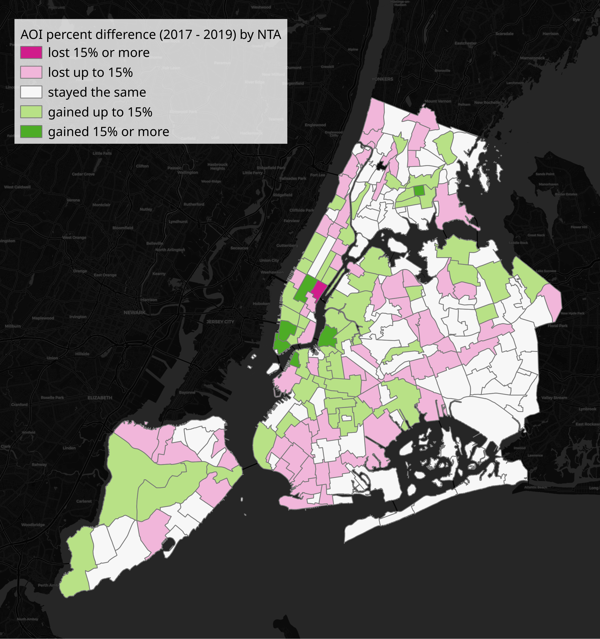
Above, green neighborhoods have more areas of interest in 2019 than they had in 2017, red-pink have fewer areas of interest in 2019 than they had in 2017. In Brooklyn and Queens you can see generally the parts closer to Manhattan got more “interesting”, while the parts further out got less so. Much of Manhattan below Harlem got more interesting, and Harlem got less interesting:
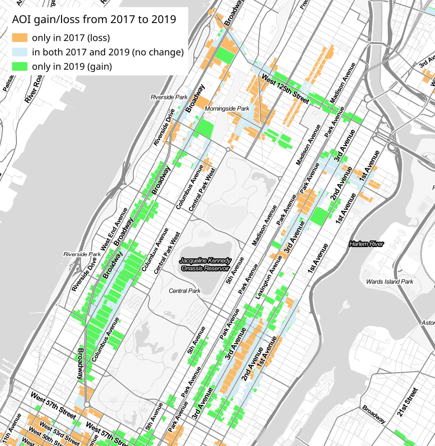
Above is a diff of the 2017 and 2019 data–orange showing areas that were areas of interest in 2017 but were not in 2019, green showing areas of interest in 2019 that were not in 2017, and gray-blue for areas that did not change. At a glance, you can see that the Upper West Side (left) only gained interesting areas, the Upper East Side (right) gained more than it lost, and Harlem (top) mostly lost.
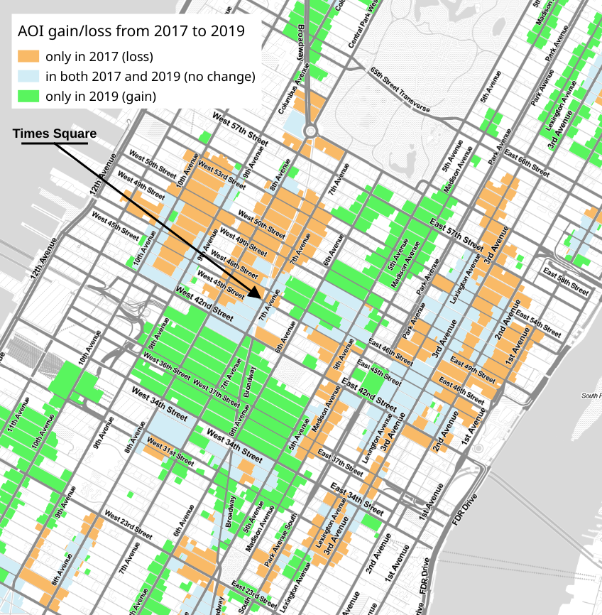
Above we see a similar diff, here centered around midtown Manhattan. While the losses and gains essentially even out, note that there are dramatically more interesting areas to the south of Times Square and dramatically fewer north and west of it.
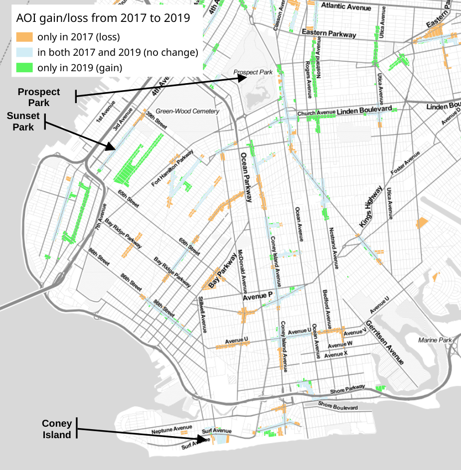
Finally, here is the lower half of Brooklyn, generally everything south of Prospect Park. Most of these areas of interest shrank, the notable exceptions being (gentrifying) Sunset Park and Prospect Lefferts, but also 5th Ave in Bay Ridge.
New York changes constantly, of course, but it would be hard to argue that these places truly got dramatically more or less interesting, not to a point that would warrant changing these shapes. It feels safe to say that these changes are a result of Google tweaking its process for creating these arbitrary shapes.
Demographics of the 2019 areas
Last time I looked at this data I used Census data and found that there were some biases in where the areas of interest were located in 2017. Specifically, predominantly black neighborhoods appeared to be less likely to be included in an area of interest.
Looking at the 2019 data, areas of interest have not become any less biased. These areas of interest are even more centered on white neighborhoods: 50% of people living in an area of interest are white, which is up from 48.5% in 2017. 42.8% of people citywide identified themselves as white in the Census.
Perhaps unsurprisingly knowing the above, the areas of interest from 2019 contain fewer black neighborhoods: 16.8% of people living in an area of interest are black, down from 17.5% in 2017. 24.3% of people citywide identified as black in the Census.
I should also note that there are slightly more asian-identified people living in 2019 areas of interest (14.4%, up from 13.9% in 2017).
Potential impacts
I’m curious to know more about how people intentionally use areas of interest–do you use them to explore new places? Are you concerned that Google Maps might be leading you to neighborhoods that aren’t particularly representative of a place if so?
Do these areas have other impacts, such as on housing prices the way neighborhood names have? Might business improvement districts and real estate companies lobby for areas to be marked as interesting, as groups have done for neighborhoods names? Or might homeowners’ groups, annoyed at tourists visiting their neighborhoods, request removal from areas, as we’ve seen with the Hollywood sign in LA?
Did this type of pressure lead to any of the changes we see above?
For my part, I’m going to continue watching these areas and using them (with some caution).